So, you have your Retrievers up and running and you’re already noticing that people actually know about the things you’ve been communicating – win! Ready to take it to the next level? Here are our pro-tips for signage that communicates effectively:
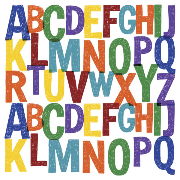
1. Choose your Typeface Wisely – Your message needs to be readable, so select a typeface or font that it can be easily read from a distance without straining the eyes. We like sans serif fonts like Arial, Helvetica and Verdana because they are easy to read with a uniform stroke and stand out well against backgrounds.
2. Size matters – Make sure that the size of your font is appropriately readable for all of your screens and their placements. If you’re not sure, send your sign to your smallest screen or the one mounted the farthest away from the eyes, and see if you can read it easily or need to strain to see it.
3. Less is way, way more – One oft-broken rule we see from our Retriever customers is over-crowding their signs with too much text. We know, there’s a lot you need to communicate, but just like Twitter has a character limit, pretend your Retriever’s do too. To test your message, stand in front of your screen and close your eyes, then open for 3 seconds. If you can’t read and understand the whole message, shrink it.
4. Choose colors carefully – A perfectly crafted message is pointless if you haven’t chosen contrasting colors that are easy for anyone to read. Some of your guests are colorblind, and everyone struggles to see similar hues placed together. We think that white text against a dark or saturated color is always a winning strategy!