Choosing your brand colors might seem like a decision that will only matter to you and your employees, but the reality is that color choice might be one of the most important decisions you make.
Considering the psychological impact of the colors you choose for your brand, and ultimately for your promotional materials and digital signage, can win you new sales and keep clients in your workplace longer or turn people off and lose business.
That said, there have been oft-cited theories (with little research to back them up) about the impact of color to evoke specific emotions. In reality, personal preference, experiences, upbringing, cultural differences, context, and more all impact the individual response to color.
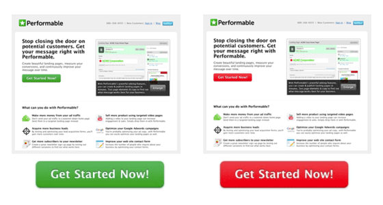
Research does tell us that certain color choices do have a measurable impact on sales and customer experiences. For example, a split-test of button colors on a website showed that a red button outperformed the green button on an identical page by 20%.
So, how do we go about choosing the right colors for our brand?
First, you must consider the perceptions you want to create and identify the values of your target customer.

“Brands can sometimes cross between two traits, but they are mostly dominated by one. While certain colors do broadly align with specific traits (e.g., brown with ruggedness, purple with sophistication, and red with excitement), nearly every academic study on colors and branding will tell you that it’s far more important for colors to support the personality you want to portray instead of trying to align with stereotypical color associations,” says Gregory Ciotti for Entrepreneur.
Once you’ve figured out your starting point, consider choosing at least three colors in your scheme that function as a background, a base, and an accent. Josh Byers at Studio Press describes these three as follows:

Background Color
This color is used the most and sets the general tone and feel of the site.
Base Color
This color is used to break up the background and is typically the baritone, the middle child, neither boring nor flashy but the glue that holds it all together.
Accent Color
This color is used the least but gives the site its personality. Unless you’re using a monochromatic color scheme, your accent color will have a stark contrast to both your background and your base color. This is typically your boldest color.
If you’ve already identified some colors that fit with your brand personality, Pinterest can be a great tool for finding a variety of color schemes that use those colors, as it is filled with palettes and examples.
Once you’re ready to commit, you can easily customize your Retriever slides either through a visual selection or through the use of HTML hex codes.
If you could use some help navigating color selection for your Retrievers, or if you’re ready to choose your brand colors, let us assist!